Air Combat
Air Combat was an emo, pop-punk band from Vancouver BC that existed from 2015 until the end of 2017.
Accomplishments include playing across Canada (from Vancouver Island all the way out to Toronto and Montreal), releasing 3 EPs and 1 full-length, plus a few cool music videos, one of which involves Slenderman.
My roles involved song writing, lead vocals, synthesizers, conceptualization, graphic design, web design and being the designated driver.
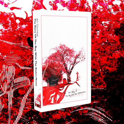
The Story of the Boy with the Stolen Name
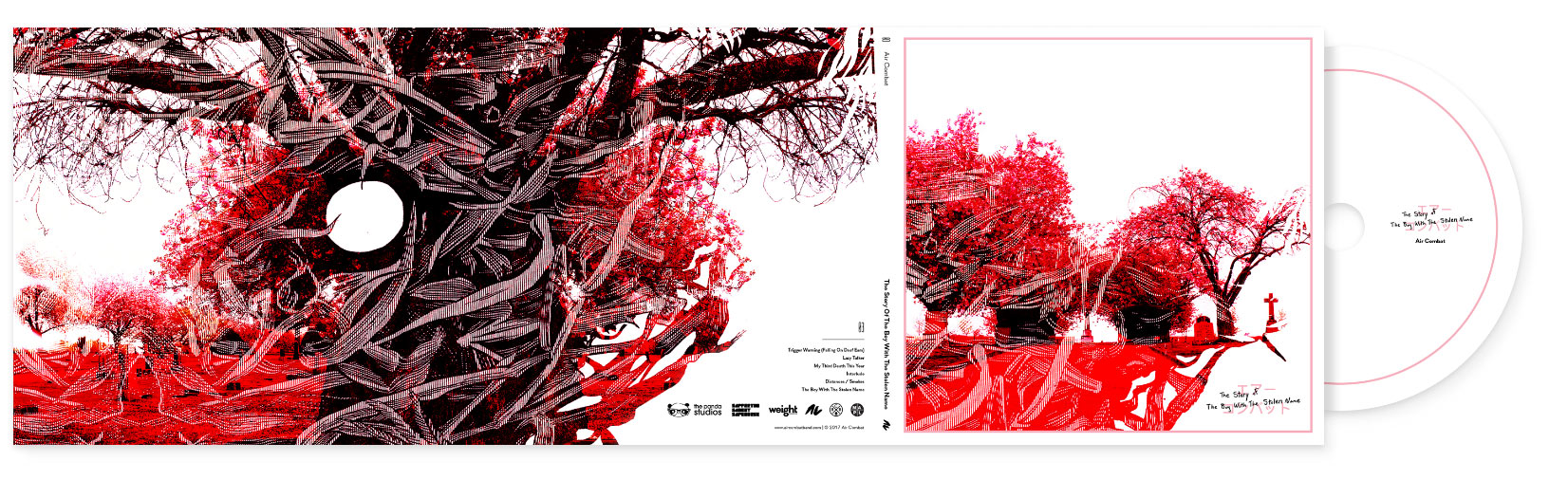
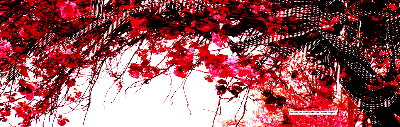
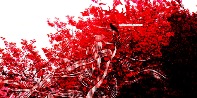
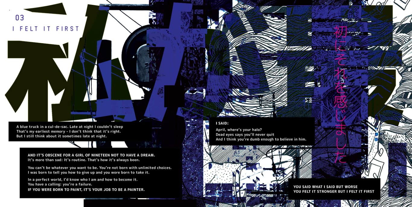
Album Art – Front & Back
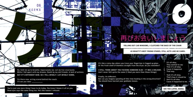
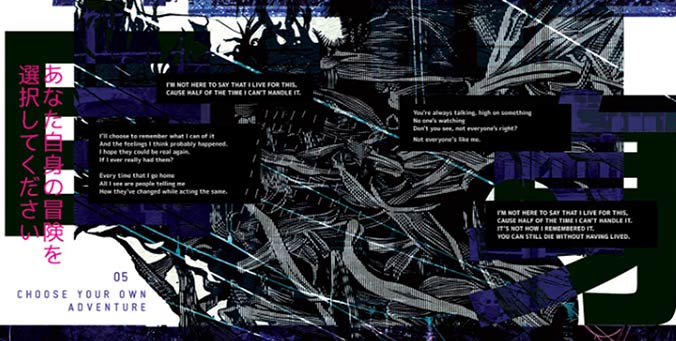
Album Cycle – The Story of the Boy with the Stolen Name (2017). This album is a six song narrative about loss and acceptance, with each song continuing the story of the last. Given the very explicit and dramatic nature of the content, a lot of melancholy is felt in the tones of the album, with the interlude feeling specifically like some kind of terrible dream of floating, unsure of what to do.
The visuals supplement this feeling and create a setting for the songs to take place. I went to the graveyard where our drummer’s grand-father is buried and took photos of the scenery. I then Photoshopped everything to be very high contrast with plenty of negative space – meant to make the world seem like some kind of afterlife dreamscape. I also pulled in some of the sketched elements and Japanese aesthetic from the band’s previous release to create a more cohesive overall look that helps build the band’s brand.
Air Combat had been fortunate enough to work with some notable studios on the production of this album – mixing and mastering was handled at The Panda Studios in Fremont, California by Sam Pura who previously worked with The Story So Far and Forever Came Calling. Tracking and editing was done at Rain City Recorders in Vancouver, BC who – as a studio – have undertaken projects with Take The Earth Beneath Us and Living With Lions.
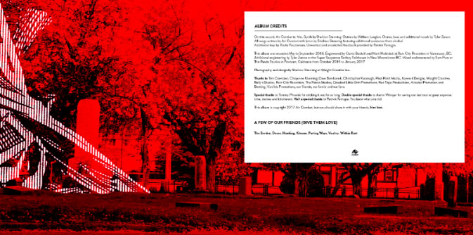
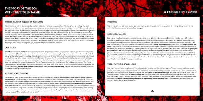
Trifold Digipak and Booklet. The CD release of the album was on a six panel cardboard sleeve, allowing for a lot of visual space. I focused on creating haunting visuals, juxtaposed with only a small amount of supporting (and ominous) text. I wanted the viewer to feel lonely in a pretty place, but not in a good way.


Music Video – Distances/Smokes. The first single from the album, shot by Keywork Designs. Some fun facts: there are over 400 posters on the walls, which took us about 3 hours to put up (and about 30 seconds to rip down). Also, the smoke machine died halfway through this shoot, but a few members of the crowd had vapes… So literally half the shots here were achieved with haze from exhaled Pineapple Crush e-juice.
Music Video – I Felt It First. Shot and directed by Kaiden Bell, I created all of the visual effects aside from just running through the woods a lot. Quite clearly a take on Slenderman, we filmed this video up in the mountains outside of Kamloops. As each member of the band gets ‘caught’, their face get visually scratched out. All the shots of the band playing were taken while a couple in their late 40’s stared at us while lounging by their lifted truck and drinking generic beer. I also included a few easter eggs in some of the frames in the form of hand written sentences, but you’ll probably have a hard time catching them.
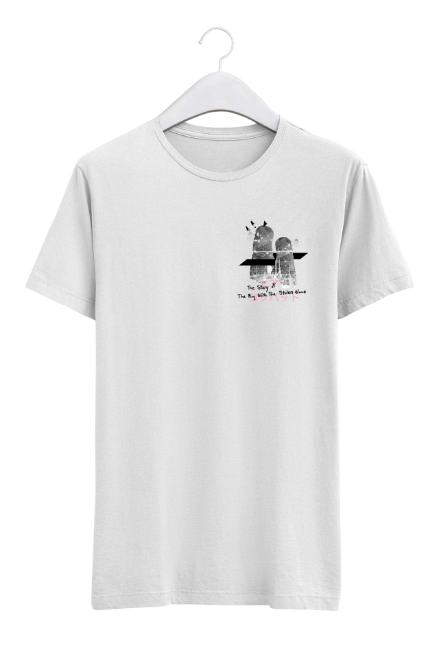
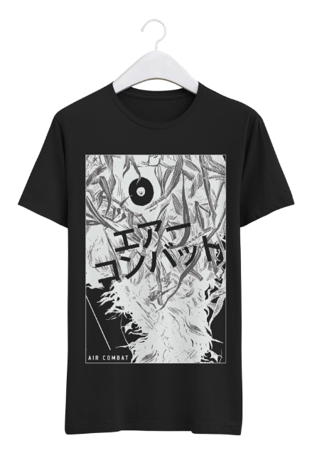
Merch Design. A challenge with screen-printed artwork is keeping the colors limited to reduce print costs (extra colors equals extra costs), but I am very fond of how these single-color prints turned out. I firmly believe that apparel designs need to be able to hold their own without the band’s brand as support in order to sell well. It’s never enough just to slap a band name on something half baked.
Also, it was a goal of mine to get a run of hoodies done and these turned out undebatably rad. However, the internal fight about releasing zip-up hoodies instead of pull-over hoodies actually got pretty heated.
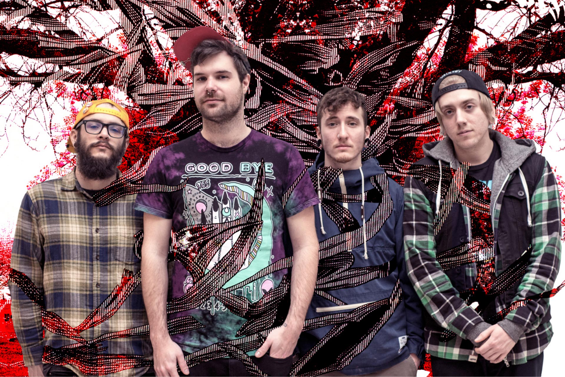
Promo shot. Photography by Kiseki Baier in Victoria, BC. I tied the shot into our relevant album art by having the vines slowly taking over our bodies.
Studio Session Video – Twenty Things Morning People Hate. Created to help promote the album “Reki”, we shot three live off the floor sessions at SoundHouse Studios. Shot and edited by Jony Roy, and engineered by Patrick Farrugia.
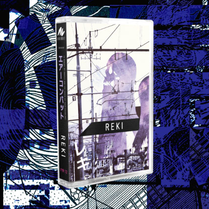
Reki
(A Subset of People are the Cause of your Problem)
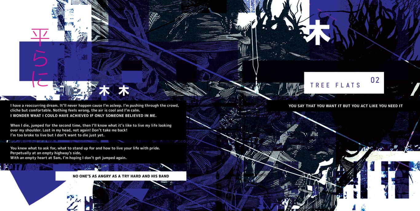
Album Art – Front & Back
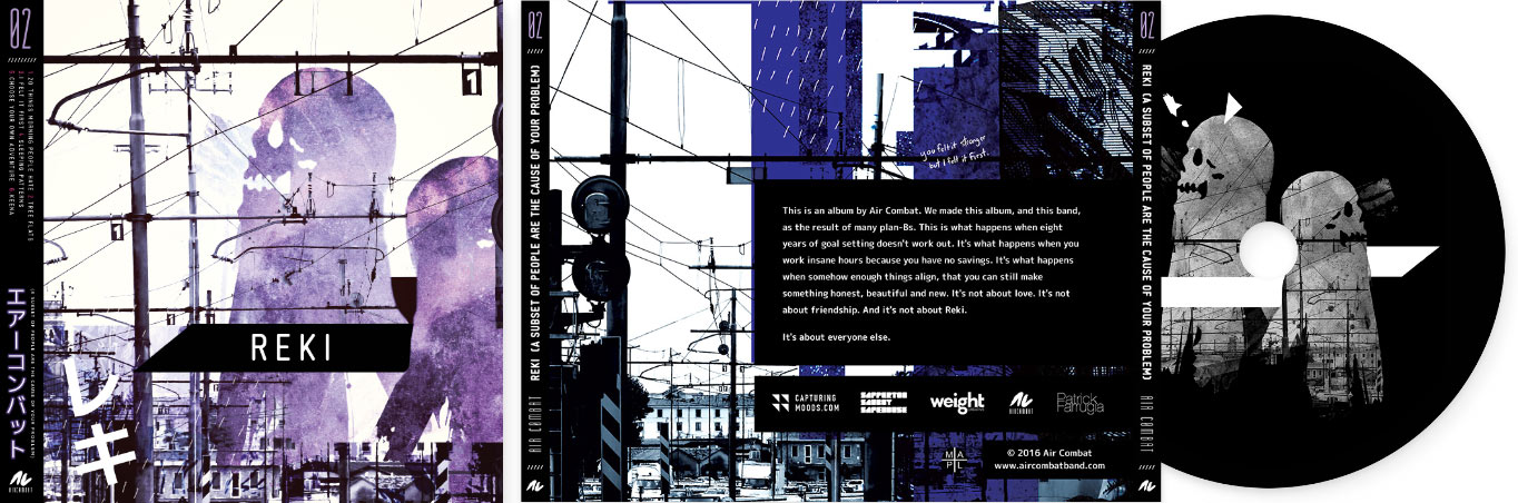
Album Cycle – Reki (A Subset of People are the Cause of your Problem) (2016). The debut six song EP from Air Combat needed to have a style that set the band apart from other offerings in the genre while reflecting the angst-ridden nature of the album. This piece uses stock photography and a skull-ghost design that I created to act as a cornerstone for the design. This graphic was then carried through to other visual pieces promoting the album like posters and merch.
The Japanese text is poorly translated, playing on the riff of how some Japanese products have poorly translated English on them (“Super good, have a fun!”). I wanted to turn the tables in reverse here.
Poster and 16 Page Booklet. Given the impact we needed this release to have, I went all out on creating a super unique look for the booklet and supporting pieces. Each song has a full spread within the CD’s booklet, giving the viewer a lot to pour over and experience as they explore each song individually.
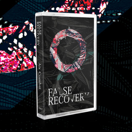
False Recovery
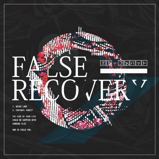
EP – False Recovery (2017). Originally, these songs were recorded as incomplete demos and were conceived to be part of a larger concept album. Each song is a place in a coherent world, with every song sequentially plotted out on a supplementary physical map. It would have taken the listener through a literal journey from point A to B to C and detailed what happened there. Sadly, this album did not come to fruition.
These songs were never finished and what is contained in these tracks is simply as far as we had gotten. Parts are missing, the lyrics weren’t final and the songs could have easily been restructured.
Largely, this release is a product of kindness courtesy of Ian Buchanan for initially tracking us and getting the ball rolling on this project, and Paul Michalewicz for his mixing and mastering services to make these tracks something that we could share with you.
False Recovery was picked as the title for this EP as a testament to how difficult moving forward can be, both logistically and mentally. Before the project completely disbanded, it felt like we had almost recovered several times, only for things to fall through yet again. Each of those ‘almost-starts’ were false recoveries.
Various Cassette Tape Designs. Thanks to our friends at Faithless Youth Records, three albums were released on limited-run cassette tapes. It was a lot of fun to pick out elements from each individual artwork to condense into a single “j-card” for each tape. Also, each physical cassette had a different look and feel – The Story of The Boy With The Stolen Name was released on a clear cassette tape with red magnetic tape inside, and Reki was a beautiful semi-transparent purple. Little touches like that really leave an impression, and add a lot of personality to this medium that isn’t possible with CDs.