Other Work


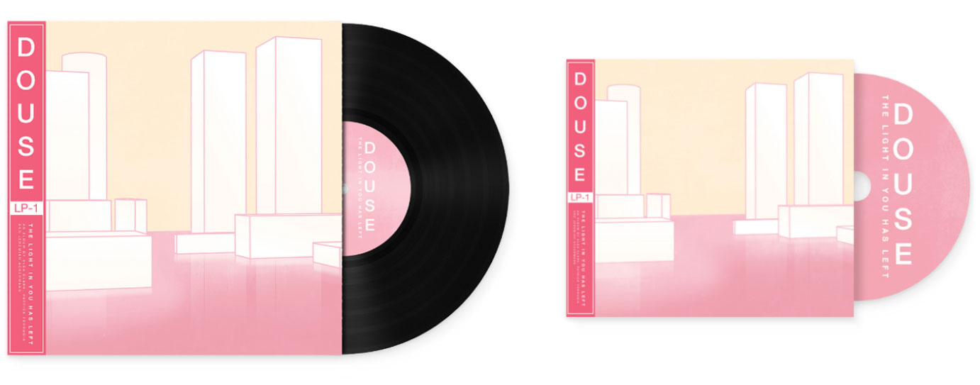
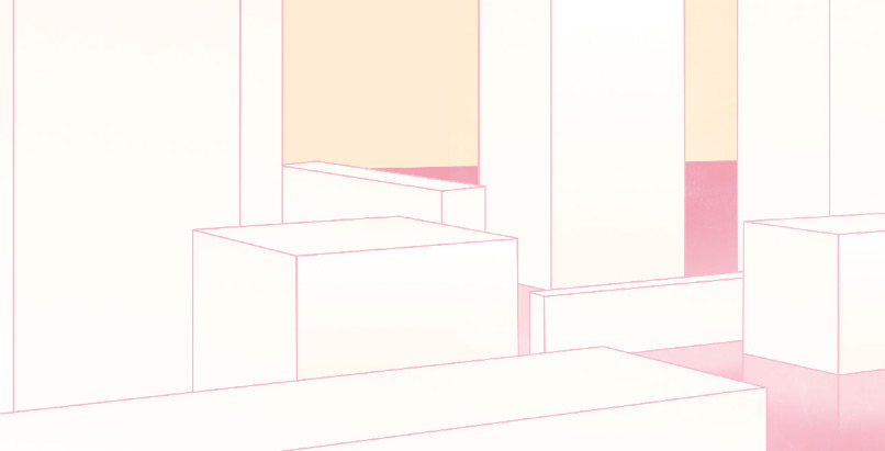
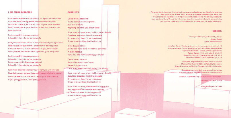
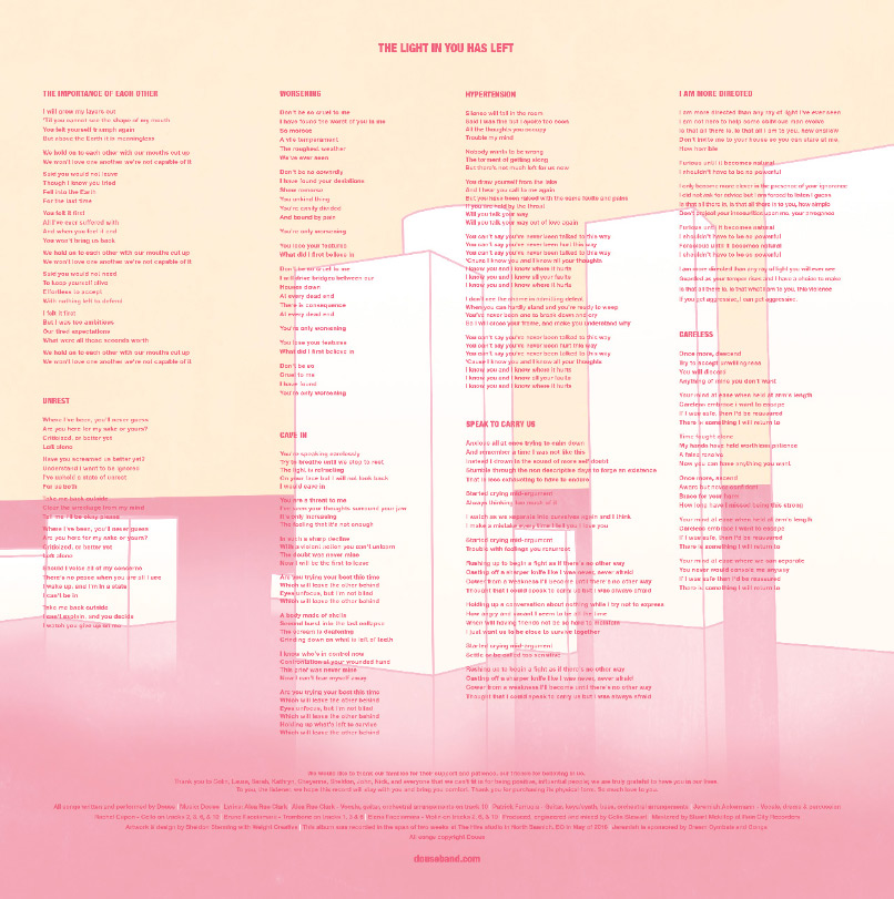
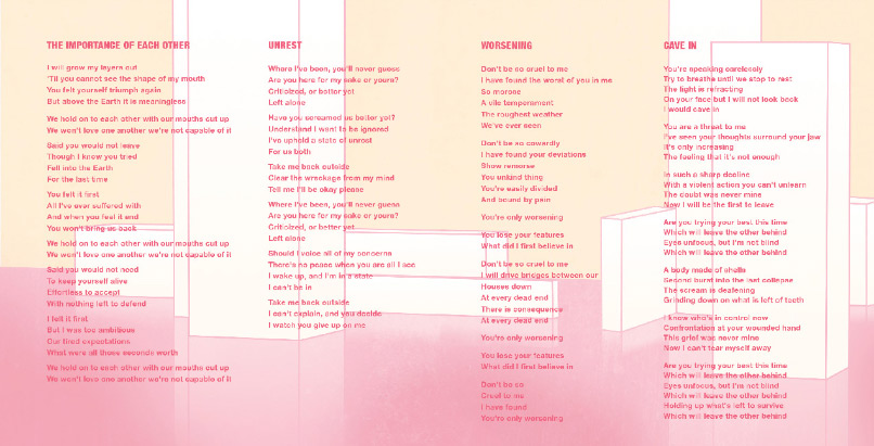
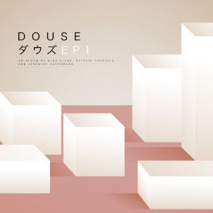
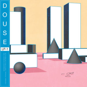
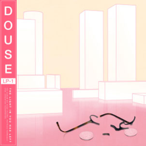
Booklet and 12” LP insert. In order to properly capture the geometric direction the band had chosen for the album, each page was initially 3D modelled, and then illustrated in Photoshop. The band also had a very specific vision for the color-palette of the design, and we worked closely together to create a work that features a decidedly pastel gamut to complete the dreamland that would be this album.
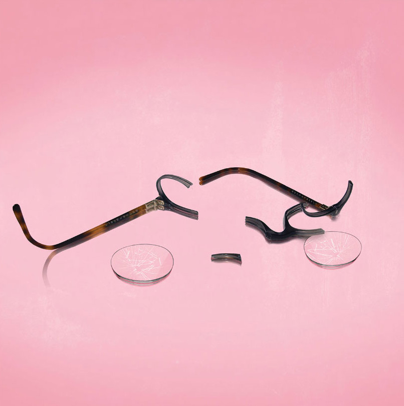
Additionally, the band requested that their then-drummer’s broken glasses be featured in some way, so some effort was put into making them look much more abused than they would have otherwise.
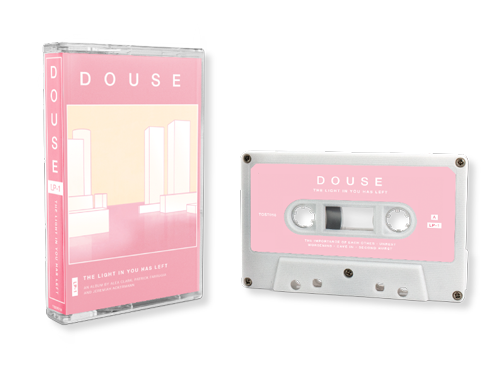
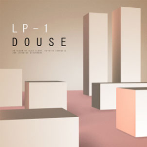
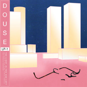
Cassette Tape. Rather than try to convert the design into a different aspect ratio (square LP to the very vertical cassette tape), it was decided that maintaining the art’s integrity would be the better solution. So the artwork here is featured in its original aspect ratio, with the rest of the content floating above and below. It has a bit of a retro feel and I personally love how this looks.
One of my favourite aspects of the cassette tape media is the ability to customize the cassette shell itself, with many distributors providing options for some truly interesting plastics and tapes. However, for this release, it made sense to pick a more reserved approach and a simple white shell was selected, making for a very refined and appropriate visual experience.
Album Art. Before forming Gleneagle and working out of Vancouver, Jackson Gardner started producing music as a solo folk-inspired artist in Kamloops BC. Working with the same producer for his music as I had at the time, it made sense to collaborate on a project together.
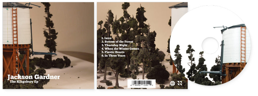
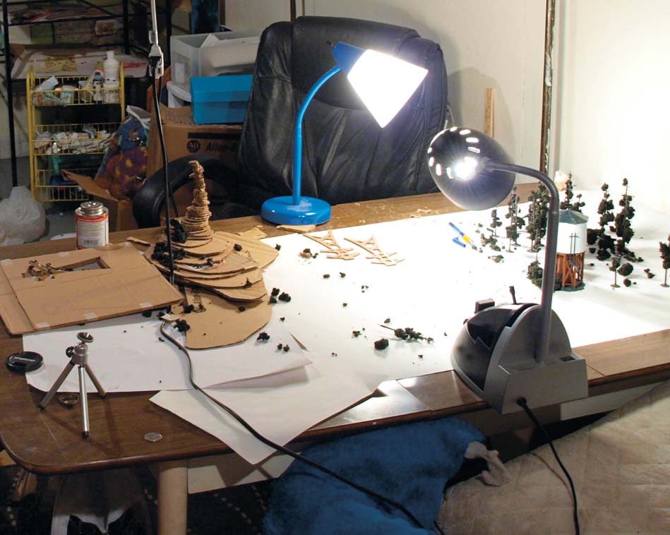
Trifold Digipack. It was important to me that Jackson’s music had an incredibly sincere look to it given the honest nature of his music. I opted to allocate some budget towards buying some model railroad buildings and trees in order to create a sort of caricature of Canadiana, another prominent aspect of his music.
What I really liked about this design is that the cover (far right) and back cover (middle) look complete, but when opened up to reveal the inside flap (far left), you can see that it is a work in progress still.


Digipack Inside. You In order to show off the lyrics, we decided to make the inside of the digipack vertical. This way additional funds didn’t need to be spent on printing booklet for the lyrics, and it allowed me to capture some of the created landscape from a different perspective.
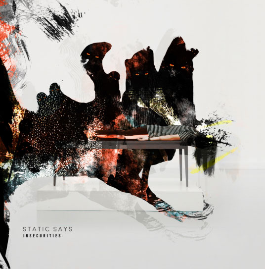
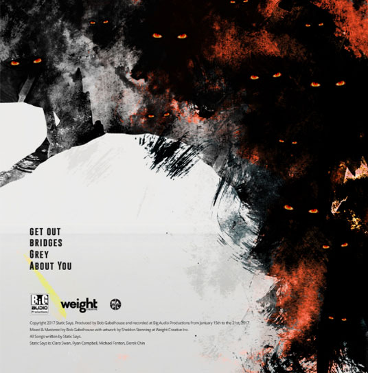
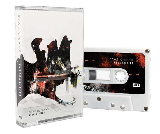
Album Art. Kelowna rock band Static Says contacted me to create album art for their debut album, Insecurities, after feeling that their vision wasn’t being captured by another designer. Together, we used stock photography and some heavy Photoshop work to focus on what the idea of insecurities might look like if they were tangible in our world.
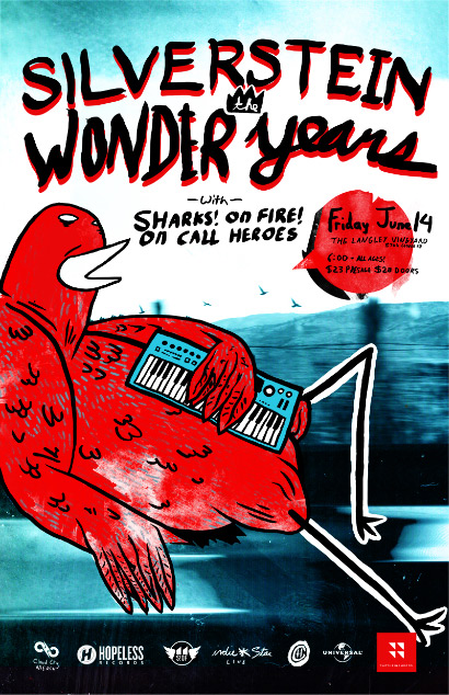
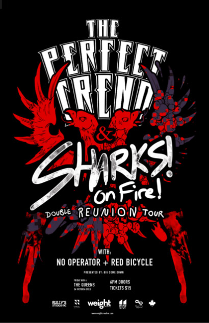
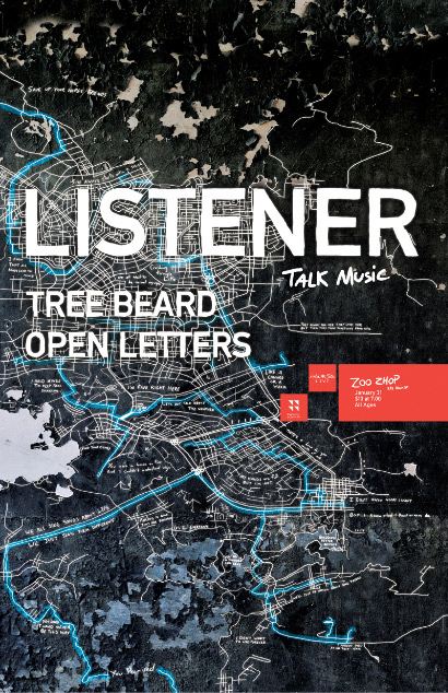
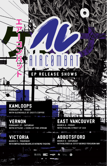
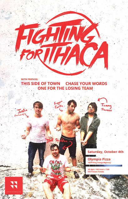
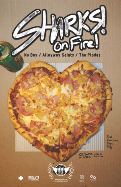
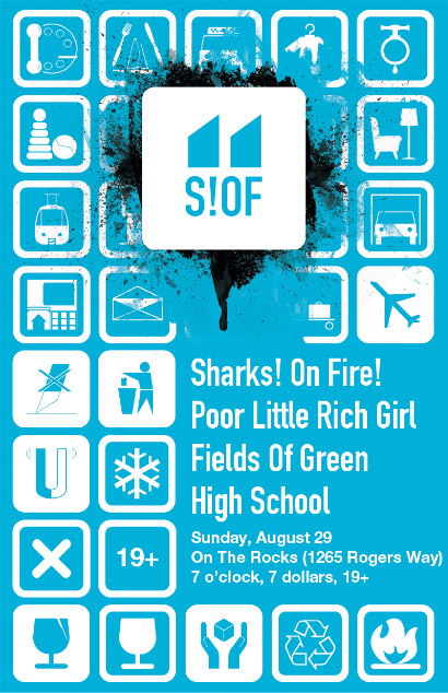
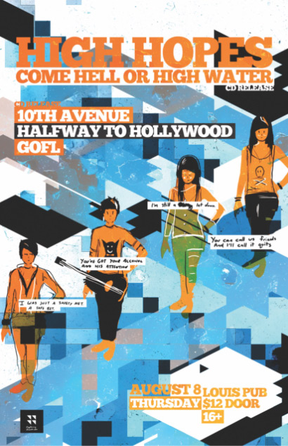
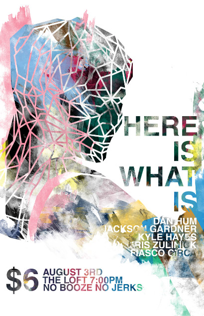
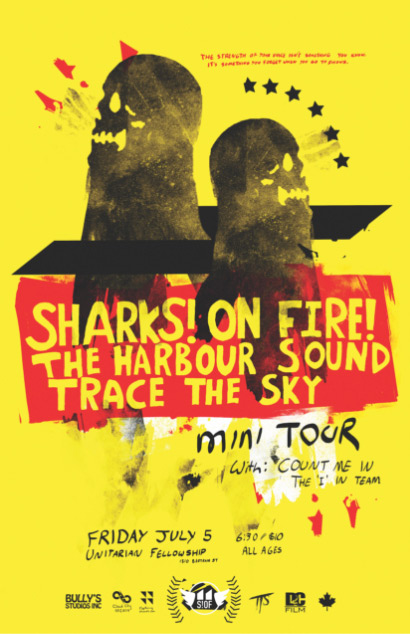
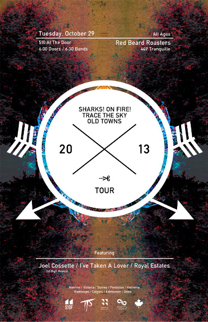
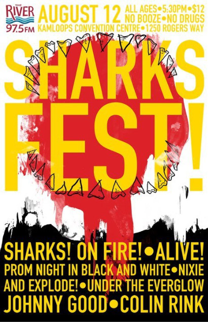
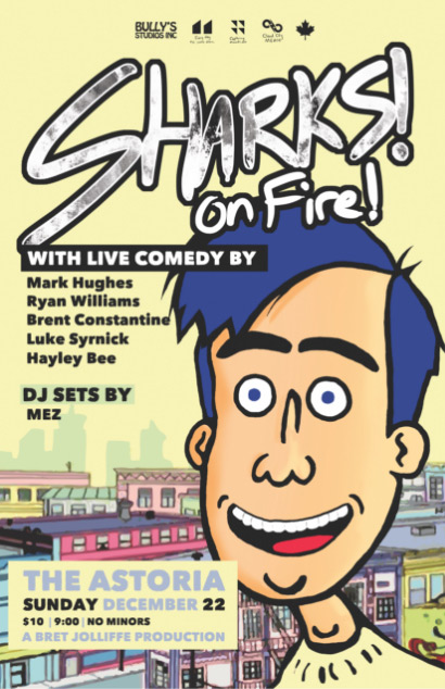
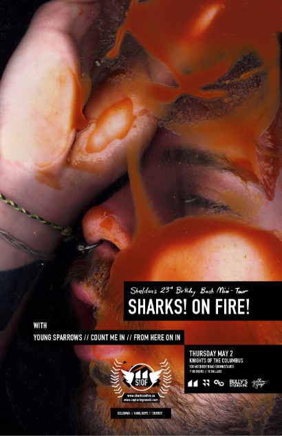
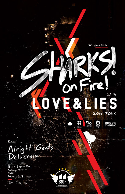
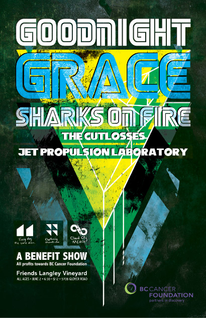
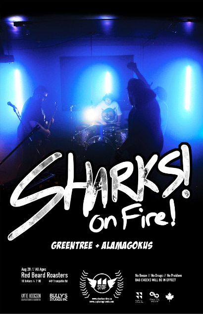
Show Posters. I’ve had the pleasure of creating hundreds of show posters, some of which feature amazing bands like Silverstein, the Wonder Years, Listener, Open Letters and many more. Here are just a few of my favourites.